Understanding Watch Hands and Legibility
A watch's hands do more design work than any other single element. A guide to the classic hand shapes, and why each was built the way it was.
 By Daniel Koh
30 August 2026 · 6 min read
By Daniel Koh
30 August 2026 · 6 min read
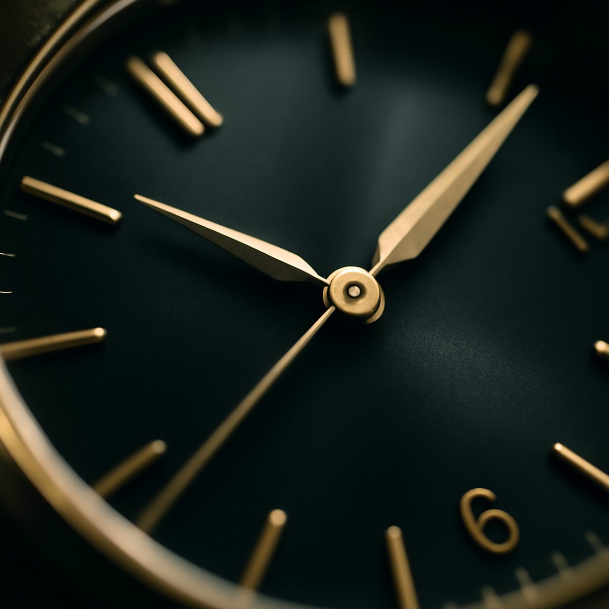
Ask most people what defines a watch’s character and they will point to the case, the dial colour, perhaps the strap. Few mention the hands, and this is a genuine oversight, because the hands do more visual work than almost any other single element on the watch. They are the part that moves, the part your eye tracks first, and their shape — tapered, faceted, luminous, skeletonised — shapes the entire personality of the dial beneath them far more than most owners give them credit for.
Hand design is also, unusually among watch components, a genuinely functional decision disguised as an aesthetic one. Every classic hand shape was developed to solve a specific legibility problem, and understanding that history changes how you look at a dial entirely.
The Dauphine Hand
The dauphine hand, tapered from a broad faceted base down to a fine point, remains one of the most elegant solutions watchmaking has produced to a genuinely practical problem: how to maximise a hand’s visibility without adding bulk that would obscure the dial beneath it. The faceted surface catches and reflects light from multiple angles as the wrist moves, meaning the hand remains legible under lighting conditions where a flat hand would simply disappear into shadow. It reads as refined largely because it is refined — an engineering solution that happens to look elegant rather than an aesthetic choice that happens to work.
This same faceted logic extends into modern engine-turned surfaces more broadly. The guilloché dial’s art of engine turning operates on a related principle — cut geometry that catches light differently at every angle — and a dauphine hand set against a guilloché dial is one of watchmaking’s most satisfying visual pairings precisely because both elements are doing the same fundamental job of reflecting available light.
Cathedral, Sword and Baton Hands
Cathedral hands, broader and more ornate with a distinctive stepped or gothic-arch profile, trade some of the dauphine’s restraint for outright visual presence, and tend to suit larger, bolder dials where a finer hand would simply read as underweight. Sword hands, tapering to a genuinely sharp point along their entire length rather than a faceted base, offer perhaps the cleanest, most legible profile of any classic shape and remain the default choice for tool and field watches where instant, unambiguous reading matters more than ornament.
A short glossary of common hand shapes
- Baton hands: simple, straight-sided rectangles, favoured for their maximum legibility and minimal visual noise
- Alpha hands: tapered with a slight bulge near the base, a mid-century shape associated strongly with vintage sports watches
- Breguet or “moon-tip” hands: slender with an open circle near the tip, among the most traditionally elegant of all classic shapes
A watchmaker restoring vintage pieces for collectors told us once that hands are “the first thing a trained eye checks, and the last thing anyone else notices” — a detail so central to a watch’s authenticity and character that mismatched or incorrectly replaced hands can meaningfully affect a vintage piece’s value, even when everything else about the watch is original.
Legibility as a Design Discipline
Good hand design is inseparable from the rest of the dial, and this is where understanding a watch’s bezel and its practical uses becomes a useful parallel — both elements exist, at root, to serve legibility first and decoration second, even on watches where the decorative result has become the primary reason people buy them. A hand shape chosen purely for its silhouette, without regard to how it performs against the specific dial colour and finish beneath it, is a design failure regardless of how elegant it looks in isolation.
“You can tell a watch was designed by someone who actually reads the time off it, rather than just draws it, by how the hands behave at four in the afternoon under office lighting.” — a watch designer, on the difference between drawing a hand and engineering one
Luminosity and Modern Practicality
Modern lume compounds have added a further layer of consideration to hand design, since the shape and surface area available for luminous fill directly affects how visible the hands remain in darkness. Broader hand shapes like cathedral or Mercedes styles carry considerably more lume surface than a fine dauphine or Breguet hand, which is part of why dive and field watches favour bolder, simpler shapes — the aesthetic refinement of a tapered faceted hand matters rather less at the bottom of a dark reef than raw luminous surface area does.
Colour and contrast against the dial matter just as much as shape, particularly for anyone who wears their watch across a genuine range of lighting conditions rather than under controlled studio light. A polished steel hand against a dark dial can, counterintuitively, become nearly invisible in low light, since the polish depends entirely on a light source to reflect from; a matte or lume-filled hand against the same dial remains legible in almost any condition. Watchmakers designing genuinely practical field or pilot watches understand this trade-off intimately, and it is why so many of the most enduringly legible designs favour a slightly less glamorous matte finish over a more photogenic polished one.
Proportion and the Whole Dial
Hand length relative to the dial’s chapter ring is a further, often overlooked detail. Hands cut noticeably short of the hour markers force a slower, more deliberate read of the time, since the eye has to bridge a visible gap between hand tip and marker; hands that extend right to the markers, or slightly past them toward the very edge of the dial, allow an almost instantaneous read. Neither approach is objectively correct, but the choice says a great deal about whether a design prioritises quick practical reading or a more considered, slower visual experience — worth noticing the next time you compare two otherwise similar watches side by side.
Reading a Watch More Carefully
Next time you handle a watch, resist the instinct to look only at the dial and case, and give the hands their own moment of attention — how they taper, how they catch the light as you turn your wrist, whether they were clearly chosen to complement the dial or simply fitted as a default. It is a small shift in attention that changes how you evaluate every watch afterward, and it is precisely the kind of detail that separates a genuinely considered purchase from an impulsive one. For more on the details worth understanding before your next watch purchase, browse our Style & Watches coverage.
Daniel has spent fifteen years arguing that the best watch is the one you never take off.