How to Wear Earth Tones With Confidence
Earth tones have a reputation for looking either brilliant or like a safari costume. The difference comes down to a handful of rules worth actually knowing.
 By Daniel Koh
30 August 2026 · 6 min read
By Daniel Koh
30 August 2026 · 6 min read

Earth tones have an image problem, and it is entirely undeserved. Say the phrase to most men and they picture a safari jacket, or worse, a head-to-toe khaki outfit that reads as costume rather than clothing. The truth is closer to the opposite: browns, olives, rusts, and stone tones are among the most forgiving colours a wardrobe can be built around, provided you understand why they work rather than simply reaching for them because a moodboard said so.
The appeal is not seasonal, though earth tones do have an obvious late-year resonance. It is structural. These colours share a common ancestor in nature — soil, bark, dried grass, unbleached wool — which means almost any two of them, worn together, look like they belong together. That is the entire secret. Where navy-and-black or grey-and-black require a careful eye to avoid looking flat, brown-and-olive or rust-and-stone practically pair themselves. Navy, for its part, sits more comfortably beside brown than many assume, as our guide to wearing brown and navy together explains.
Start With a Value Anchor
The single most common mistake is treating every earth tone as interchangeable in weight. They are not. A deep chocolate brown reads almost as dark as black; a pale stone or oatmeal reads almost as light as white. Building an outfit around earth tones works best when you pick one anchor — usually the darkest piece, a jacket or trouser in espresso or bark brown — and let everything else sit lighter than it. This creates the same tonal logic a monochrome outfit relies on, just warmer.
A simple formula that rarely fails: dark brown or olive on the bottom half, a lighter camel, oatmeal, or rust on top, with one accessory — a belt, a watch strap, a bag — bridging the two in a mid-tone. It reads as considered without requiring any real colour theory.
Texture Does the Work Colour Can’t
Because earth tones sit so close together on the colour wheel, an outfit built entirely from them can flatten out and look monotonous if every piece has the same texture and finish. This is where texture becomes the actual variable doing the styling. A brushed suede jacket over a smooth cotton shirt, a ribbed knit against a crisp trouser, a nubby wool scarf against flat leather — the contrast in surface keeps the eye moving even when the colour palette barely shifts. This is worth remembering when choosing fabrics for tailoring generally: texture reads before colour does, at conversational distance.
- Corduroy, suede, and heavy knits amplify the warmth of earth tones and suit cooler months or air-conditioned interiors.
- Linen and lightweight cotton in the same palette read fresher and work better for Singapore’s climate, where a full corduroy outfit is a genuine endurance test.
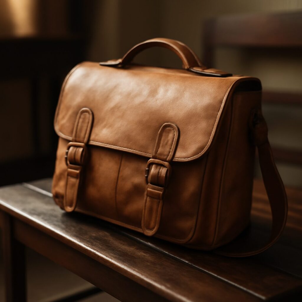
- Leather — a bag, a belt, a pair of loafers — in cognac or chestnut ties the whole look together without adding a new colour to track.
The One Rule Worth Memorising
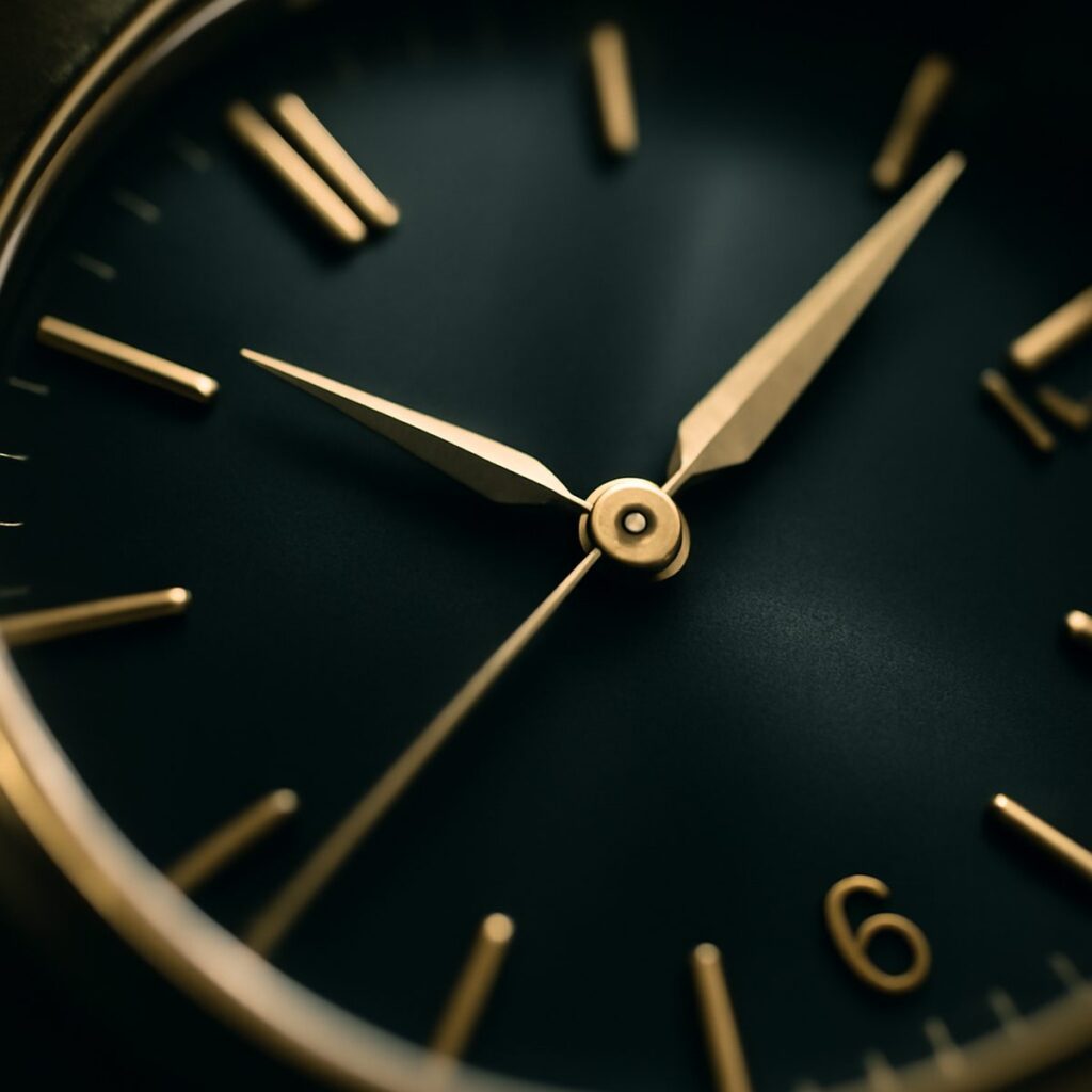
Keep metals and accessories warm. Gold, brass, and bronze hardware sit naturally within an earth-tone palette; silver and chrome tend to look slightly cold and out of step against brown and olive, the way a fluorescent bulb looks wrong in a room lit by candles. This applies to belt buckles, watch cases, and even eyewear frames. It is a small detail, but it is the kind of small detail that separates an outfit that looks deliberate from one that looks assembled. For a cooler, more formal register, our guide on how to wear white after dark shows a similar restraint at work in the evening.
“The trick nobody tells you is that earth tones forgive mismatches other colours don’t,” a stylist friend mentioned recently, watching a client agonise over whether rust and olive “went.” “They’re from the same family. Of course they go.”
Where Earth Tones Go Wrong
The failure mode is almost always the same: too much of one shade, worn head to toe, with no tonal variation. A single-colour khaki outfit reads as uniform rather than style. The fix is simple — vary the depth of the tone across the outfit, dark to light, and introduce at least one piece that is technically outside the earth-tone family but shares its warmth, such as a cream or ivory shirt. That neutral acts as a resting point for the eye and stops the outfit from feeling like a themed costume.
The other common error is pairing earth tones with cool-toned denim. A crisp indigo jean fights with brown and olive rather than complementing them; a washed, slightly faded, or black-adjacent denim sits far more comfortably in the same frame. If tailoring rather than denim is the base, this is where a considered check suit in a brown or olive base cloth becomes genuinely useful — the pattern itself often already contains two or three earth tones, doing half the pairing work before you’ve added a single accessory.
Building It Into a Capsule
Earth tones are, somewhat counterintuitively, one of the easier palettes to build a small, high-rotation wardrobe around, because so many pieces cross-pollinate. A camel overcoat works with grey trousers as easily as with olive ones; a rust knit sits under a navy jacket almost as well as a brown one. If you’re starting from scratch, resist buying every earth tone at once — pick two, build fluency with them, and add a third once the first two feel automatic rather than effortful. This is the same logic behind building a ten-piece capsule wardrobe: fewer pieces, chosen for how well they recombine, beat a closet of one-outfit purchases.
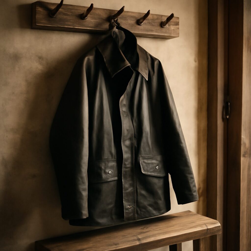
For outerwear specifically, few pieces carry earth tones as naturally as the barn jacket, whose entire heritage is rooted in exactly this palette — waxed cotton, corduroy collar, brass snaps — worn originally for function rather than fashion, which is precisely why it still looks right decades later. Pair it against a lighter base and the earth-tone logic more or less styles itself.
Confidence with earth tones, in the end, comes less from any single rule than from repetition — wearing the palette enough times that the pairings stop requiring thought. Start with two tones, add texture before you add colour, and keep the metals warm. The rest follows. For more on assembling a wardrobe that ages as well as it dresses, see Style & Watches.
Daniel has spent fifteen years arguing that the best watch is the one you never take off.