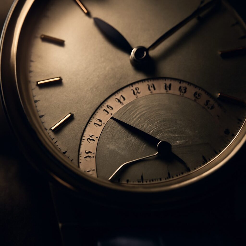
A Guide to Reading a Watch Dial
The dial is where a watch does its talking. Learn to read its markings, its script and its small print like a page you have read a hundred times.
 By Daniel Koh
2 September 2026 · 6 min read
By Daniel Koh
2 September 2026 · 6 min read
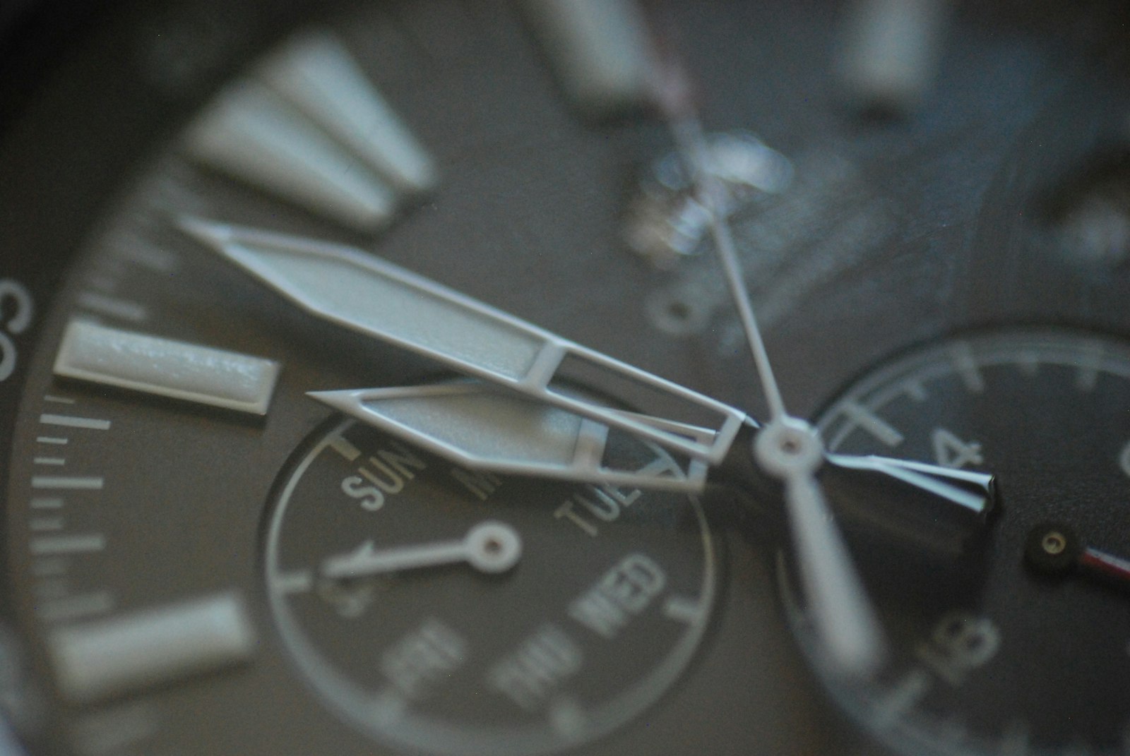
Hold a good watch to the light and the dial stops being a face and becomes a page. There is a grammar to it, a small typography of applied indices, printed lines and quiet abbreviations that most of us glance past on the way to the time. Learn to read it and the wrist becomes a more interesting place. You begin to see the choices a maker made, the corners they refused to cut, and the little confessions a dial makes about how it was built and what it was built to do.
Reading a dial is not a technical exam. It is closer to reading a room. The information is all there, but the pleasure is in the ordering of it, in the way a well-laid dial guides the eye from the centre outward without ever raising its voice. What follows is a slow walk across a dial, from the heart out to the rim, and back again to the small print that says the most.
The hands and the centre
Start where the hands are pinned. The centre of a dial is its busiest junction and its hardest test. Three hands must share one axis and still be legible, which is why the best dials give each a distinct length and shape: a broad hour hand, a slimmer minute hand that reaches the outer track, and a thread of a seconds hand that sweeps or ticks depending on the movement beneath. On a mechanical watch the seconds hand glides; on a quartz one it steps once a second. That single motion tells you, before you read a word, what kind of heart is beating below.
Look at the tips. A minute hand that falls just short of its track is a small failure of proportion; one that lands exactly on the minute markers is a sign someone cared. Luminous hands carry a filling of lume that glows at night, and the way that lume is applied, flush and even or slightly domed, is another quiet tell. If you are still deciding what your first serious piece should be, our guide to buying your first mechanical watch is a sensible place to begin before you fuss over hands.
The indices and the track
Move outward to the hour markers. These are the dial’s furniture, and they come in two broad families: printed and applied. Printed markers are flat, ink on lacquer, honest and clean. Applied markers are separate pieces of metal fixed to the dial, catching light at their facets and throwing tiny shadows that give a dial its depth. Run a loupe across them and you will see whether the edges are crisp or soft, whether the polishing is even, whether they sit square. Applied indices are more work and more money, and a maker who uses them is telling you where their priorities lie.
Between the markers runs the minute track, sometimes a simple ring of dots, sometimes a railway of fine lines. The track is the dial’s ruler, and its precision matters more than its prettiness. On a chapter ring, that raised outer band, the track can be tilted slightly toward the eye to aid reading at an angle. Numerals, when a dial uses them, carry their own character: Roman for the dress watch, Arabic for the field and the pilot, a mix of both for the vintage-minded. The typeface is never accidental. For a dial that deliberately mixes both, see why the California-dial watch wins hearts.
The small print at six
Now the confession box. Near the bottom of most dials, often huddled above or below the six, sits the small print, and it is the most eloquent part of the whole page. Here a dial may declare its material, its water resistance, the nature of its movement, and sometimes a phrase or two of provenance. Words such as automatic or chronometer are not decoration; they are claims, and a claim printed on a dial is one a maker must stand behind.
The dial is the one part of a watch the owner sees every day, so it is the one part that cannot lie for long.
Depth ratings appear here too, and they reward a little scepticism. A number is a laboratory figure, not a licence, and reading it sensibly is a small discipline in itself. The finish of this text, whether it is printed sharply or bleeds at the edges, is a fair proxy for the care taken everywhere else. A blurred line of small print is rarely the only corner cut.
Colour, texture and light
A dial is a surface before it is a set of markings, and its surface is where character lives. A matte dial drinks light and reads calmly; a lacquered one throws it back and feels dressier. Textures multiply the effect: a sunburst brushing sends a moving line of brightness across the face as the wrist turns, a grained or frosted ground softens reflections, an enamel dial holds a depth that photographs can never quite carry. Colour behaves differently under a desk lamp than under a grey sky, and part of living with a watch is learning how yours changes through a day.
Vintage dials add another layer, because time edits them. Sunlight and moisture can warm a black dial toward brown, or turn white indices cream, and collectors have learned to prize these changes rather than fear them. If that appeals, our piece on why the sector-dial watch enthralls collectors shows how a spare, well-drawn face ages with unusual grace.
Reading a dial as a habit
Once you have walked a dial from centre to rim you can do it in a glance, and that glance changes how you shop and how you wear. You start to notice when a date window is cut cleanly into the dial rather than floating in a mismatched frame, and once you have set one properly, as our guide to setting a watch date correctly explains, you never look at the aperture the same way again. You notice how a strap can lift or flatten a dial’s colour, which is half the argument of our guide to choosing a watch strap. And you begin to build the wider literacy that runs through our Style & Watches pages, where the small decisions add up to a point of view.
None of this makes the watch keep better time. It simply makes the time more pleasant to keep. A dial you can read fully is a dial that keeps giving, long after the novelty of ownership has settled into habit, and that quiet, renewable pleasure is the whole point of choosing carefully in the first place. Read the page often enough and it starts, in its small way, to read you back.
Daniel has spent fifteen years arguing that the best watch is the one you never take off.