The California Dial and Its Curiosities
Half roman numerals, half arabic, split cleanly down the middle — the California dial remains one of watchmaking's odder and more charming curiosities.
 By Daniel Koh
30 August 2026 · 6 min read
By Daniel Koh
30 August 2026 · 6 min read
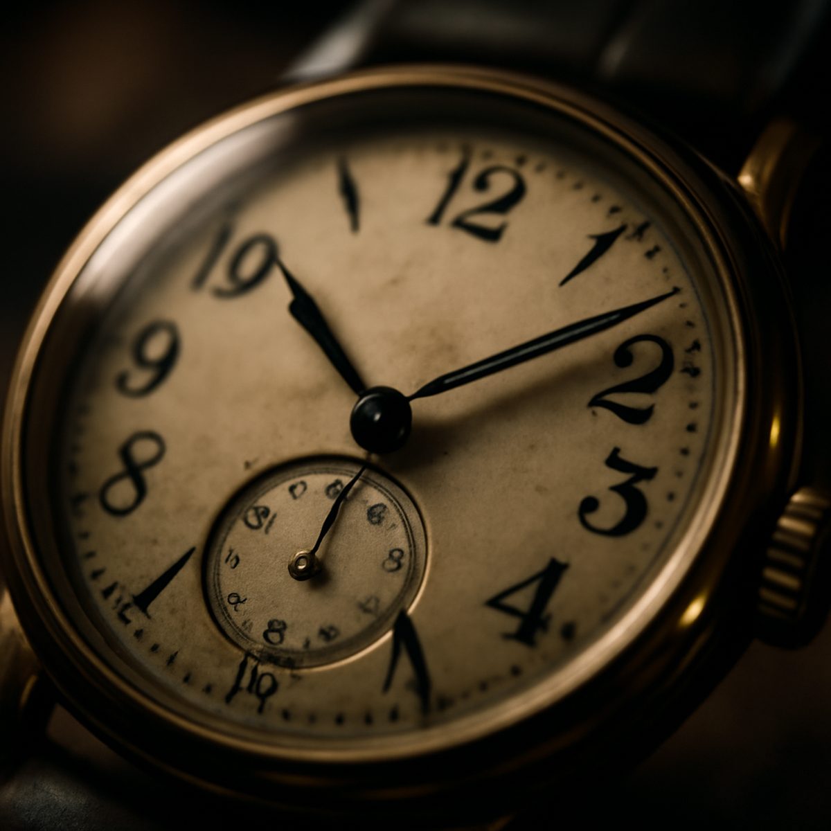
Open a case of genuinely vintage watches and, sooner or later, one dial will catch the eye for reasons that take a moment to place. The numerals do not match. The top half runs in Roman numerals, stately and formal; the bottom half switches abruptly to Arabic numbers, plain and legible. This is the California dial, a design so specific and so strange that it has earned an entire subculture of collectors devoted to tracking down good examples.
Where the Name Comes From
The dial’s name is, appropriately, a matter of some dispute — a fitting state of affairs for a design whose entire identity is built on inconsistency. The most widely repeated account traces it to watch customisers working in California in the 1930s and 40s, who took plain military-style watches and refitted them with these split dials, part decorative flourish and part practical improvement to legibility over a fully Roman face. Whether the story is entirely accurate or partly retrospective mythology hardly matters to collectors today; the name has stuck regardless, and it does the job of evoking exactly the era and attitude the dial represents.
Why the Split Design Actually Works
On paper, mixing two numeral systems on a single dial sounds like a design failure rather than a deliberate choice. In practice, the California dial succeeds because the split is horizontal and symmetrical rather than arbitrary — Roman numerals occupy the upper half, from nine through three, while Arabic numerals hold the lower half, from three through nine. This creates a genuine visual hierarchy: the upper half reads with old-world formality, the lower half with modern clarity, and the eye adjusts to both without confusion once it understands the pattern. It is, in its own odd way, a genuinely successful piece of graphic design disguised as an inconsistency.
There is also a practical explanation that collectors often cite alongside the aesthetic one. Roman numerals at the bottom of a dial, near six o’clock, can be harder to read at a glance than Arabic numbers, particularly on smaller vintage cases with limited dial real estate. Splitting the format addressed this minor legibility problem while retaining the formality that Roman numerals lend to the upper half of the face — a genuinely thoughtful piece of problem-solving hiding inside what looks, at first glance, like an aesthetic quirk. For a broader sense of how dial choices shape a watch’s whole character, understanding watch dials and textures is worth reading alongside this piece.
Collecting California Dials Today
Genuine vintage examples, particularly from the design’s mid-century heyday, command real premiums among serious collectors, and the market has become sophisticated enough that authentication matters considerably — dials have been refinished, reprinted, or entirely fabricated to mimic the look on watches that never originally carried it. Buyers serious about collecting in this niche should work with dealers who can properly authenticate a dial’s originality rather than trusting a listing description alone.
Modern watchmakers, sensing the enduring appeal, have periodically revived the design on new production pieces, offering a considerably more affordable and considerably less fraught way to own the look. These reissues rarely carry the same collector cachet as an original, but they do let a wider range of enthusiasts enjoy the split-dial design without navigating the vintage market’s authentication minefield. For a closer look at why collectors keep returning to this split layout, see why the California-dial watch wins hearts.
What to Look For When Buying Vintage
- Consistent patina across both numeral sections — mismatched ageing is a common sign of a later refinish.
- Original printing techniques appropriate to the watch’s era, which a knowledgeable dealer or independent appraiser can help verify.
- Provenance documentation where available, since California dial fakes have become sophisticated enough to fool casual buyers.
- A lume plot consistent with the dial’s claimed age, since replacement lume application often gives away a later restoration.
The Cases and Movements Behind the Dial
It is worth remembering that the California dial is, strictly speaking, only a dial format, and it has appeared across a genuinely wide range of case shapes, sizes, and movements over the decades since its introduction. Early examples tended to house relatively simple manual-wind movements in modestly sized cases suited to the era’s smaller wrist proportions, while later revivals have paired the same dial format with contemporary automatic movements and considerably larger case diameters. This flexibility is part of why the design has survived so many decades of shifting taste — the dial itself carries the identity, while the watch built around it can adapt freely to whatever case conventions a given era favours.
Some of the more interesting vintage examples pair the split dial with a genuinely unusual case shape — cushion cases, tonneau cases, and other mid-century experiments that have since fallen out of mainstream production. Collectors who enjoy this particular corner of watchmaking history often find that hunting for these less common case pairings becomes as engaging as the dial hunt itself, adding a second layer of rarity to an already niche pursuit.
“It’s the kind of dial that makes you look twice,” one longtime vintage dealer told us, “and then keep looking. Most design quirks fade after the second glance. This one doesn’t.”
A Curiosity Worth Understanding
The California dial occupies an unusual place in watchmaking history: too eccentric to have ever become mainstream, too charming to disappear entirely. It survives today largely through collector enthusiasm and periodic revivals, a reminder that not every enduring design needs to have been universally popular in its own time — sometimes a genuinely odd idea, executed with enough conviction, simply outlasts its more conventional contemporaries. Anyone building a broader appreciation for dial design would do well to compare it against other unusual formats, such as the sector dial and vintage revival or the salmon dial and its enduring appeal, both of which share the California dial’s knack for turning a technical constraint into a genuine style statement.
For more on the details that separate a considered watch collection from an arbitrary one, the wider Style & Watches section covers the full range of what makes a dial, a case, or a strap actually worth caring about.
Daniel has spent fifteen years arguing that the best watch is the one you never take off.