Understanding Watch Dials and Textures
Colour gets the attention, but texture does the real work on a watch dial — a guide to the finishing techniques worth understanding before you buy.
 By Daniel Koh
30 August 2026 · 6 min read
By Daniel Koh
30 August 2026 · 6 min read
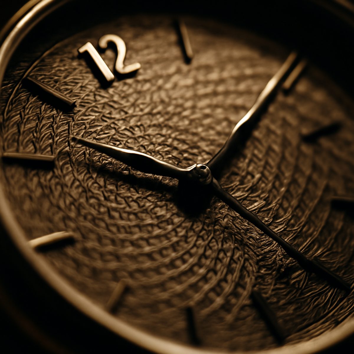
Ask most people what they notice first about a watch dial and they will mention colour — blue, black, silver, green. Spend enough time around serious collectors, though, and the conversation shifts almost entirely to texture. How light moves across a dial’s surface, how a finish catches or scatters that light depending on the angle of the wrist — this is where a genuinely well-made dial separates itself from a merely well-coloured one.
Why Texture Matters More Than Colour
A flat, uniformly coloured dial reads the same from every angle, which is precisely its limitation. A textured dial, by contrast, changes character constantly as light shifts across it through the course of an ordinary day — brighter and more dynamic under direct sun, quieter and more subtle indoors. This dynamism is what gives a genuinely well-finished dial its sense of depth and quality, a quality that photographs poorly and reveals itself only in person, which is one reason experienced buyers insist on seeing a watch in the metal before committing to a purchase based on catalogue images alone.
Guilloché and Engine-Turning
Among the most prized dial textures is guilloché, a mechanically engraved pattern of fine, repeating lines cut into the dial’s surface using a rose engine or straight-line engine, historically operated by hand. The resulting texture — often a basket-weave, sunburst, or clou de Paris pattern — catches light in a way that machine-stamped imitations struggle to replicate convincingly. Genuine hand-guilloché work remains a genuinely rare skill, practised by a small number of specialist artisans, which is why dials bearing authentic engine-turning command real premiums over stamped or laser-etched imitations of the same pattern. The guilloché dial and the art of engine-turning covers this specific technique in considerably more depth for anyone drawn to this end of the market.
Enamel, Lacquer, and Sunburst Finishes
Enamel dials represent an entirely different textural tradition — glass-based pigment fused to a metal base through repeated firing at high temperature, producing a glossy, almost liquid-looking surface with genuine depth beneath the top layer. The technique is painstaking and failure-prone even for skilled artisans, since each firing risks cracking or discolouring the piece, which is precisely why enamel dials remain rare and expensive relative to their printed or lacquered counterparts. The enamel dial and traditional craft explores this technique’s history and its modern revival in more detail.
Sunburst finishing, by contrast, is considerably more common and considerably more affordable while still delivering genuine textural interest. Fine radial brushing from the dial’s centre outward catches light in a way that shifts dramatically with wrist movement, producing an effect somewhere between a solid colour and a genuinely dynamic surface. It has become something of a modern default for mid-range watches specifically because it delivers real visual interest without the cost of hand engraving or enamel firing. For dials that shift in tone from centre to edge, our guide to the best fumé and gradient dials explores another modern favourite.
What to Look For When Evaluating a Dial in Person
- Tilt the watch under different light sources — a genuinely well-finished dial should reveal new detail rather than staying visually flat.
- Look closely at pattern consistency across the dial; hand-finished textures show minor, charming irregularities that stamped patterns lack entirely.
- Check the dial’s edge and the numeral printing for crispness, which indicates careful finishing throughout rather than just on the visible centre.
- Compare the dial in both bright daylight and dim indoor light; some textures perform beautifully in one setting and disappoint in the other.
Matte and Grained Finishes
Not every prized texture aims for shine or shimmer. Matte and grained dials, often produced through sandblasting or a fine granular coating, offer a deliberately understated, low-glare alternative that has become increasingly popular among collectors drawn to tool watches and field-style pieces. This approach trades dramatic light interaction for genuine legibility in bright outdoor conditions, where a highly reflective sunburst or glossy enamel dial can actually wash out and become harder to read. The choice between a reflective and a matte finish is, in this sense, not purely aesthetic — it has real practical consequences depending on how and where the watch will actually be worn. Our selection of the best sandblasted and matte dials gathers some of the more accomplished examples of this restrained approach.
Salmon and other warm-toned matte dials have enjoyed a particular resurgence in recent years, their soft, slightly dusty colour reading very differently depending on ambient light, without relying on a high-shine finish to create that variation. The salmon dial and its enduring appeal explores this specific colour-texture combination in more depth, for anyone drawn to this quieter register of dial design.
“People buy a dial colour,” one independent watchmaker told us, “but they fall in love with a dial texture. The colour is what gets you looking. The texture is what keeps you looking, years later.”
Sector Dials and Structured Layouts
Beyond surface treatment, dial texture can also come from structural layout rather than finishing technique alone. Sector dials, which divide the face into distinct geometric zones through recessed sections or contrasting finishes, add a genuinely different kind of visual depth — texture achieved through construction rather than surface treatment. The sector dial and vintage revival covers this particular format’s history and its recent return to favour among collectors seeking something more architecturally interesting than a flat, single-texture face.
Understanding these distinctions — engraved versus fired versus brushed versus structural — gives a buyer a genuinely deeper vocabulary for evaluating any watch, well beyond simply reacting to colour. It also tends to change how a collection develops over time: buyers who start paying close attention to texture often find themselves seeking out variety across finishing techniques rather than simply collecting the same sunburst finish in a rotation of different colours. Among the quieter finishes worth seeking out are the soft, pale surfaces covered in our guide to opaline and silvered dials.
None of this is to suggest texture should override every other consideration when buying a watch. Movement quality, case proportions, and overall design coherence still matter enormously. But dial texture is the detail most easily overlooked by newer collectors focused purely on brand or colour, and it is often the detail that experienced collectors end up caring about most once the initial excitement of ownership settles into genuine long-term appreciation.
For the fuller picture of how these details combine into a genuinely considered collection, the wider Style & Watches section covers everything from dial finishing to case proportion in similar depth.
Daniel has spent fifteen years arguing that the best watch is the one you never take off.