The Quiet Luxury of the Zellige Splashback
No two are alike: the hand-made zellige tile brings a shifting, watery light to a kitchen splashback that machine-made tile can only ever imitate.
 By Priya Nair
1 September 2026 · 6 min read
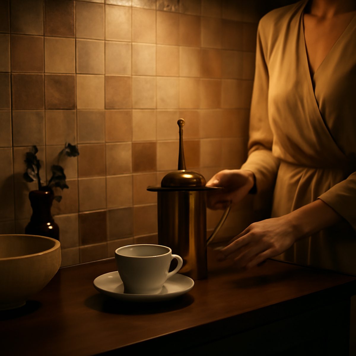
Run your eye along a wall of true zellige and it seems to move. The little glazed tiles catch the light unevenly, each one slightly different in tone and surface, so that what should be a flat plane shimmers like water. This is the quiet luxury of the zellige splashback — a wall that a machine could never make, whose entire beauty lies in the honest irregularity of the hand. In a kitchen full of engineered surfaces, it is often the one thing that looks genuinely alive.
Zellige has travelled a long way from its origins in the tilework of Morocco, where it has adorned palaces, fountains and courtyards for centuries. Today it turns up above kitchen counters from Singapore to Stockholm, prized precisely because it refuses to be uniform. But it is a material with a temperament, and to use it well you have to understand what you are buying — and forgive it its imperfections, because they are the point.
Made by hand, and it shows
Genuine zellige is made from natural clay, hand-shaped, sun-dried, glazed and fired in wood kilns, then often cut by hand into shape. Every stage introduces variation. The clay warps a little. The glaze pools and thins. The firing scorches some tiles darker than others. The result is a tile of subtle undulations, pinholes, crackle and colour drift — a surface with visible evidence of the hand and the fire that made it.
This is the whole appeal, and it is why zellige belongs in the same conversation as other genuinely hand-made tiles: it carries the maker’s imprint in a way industrial tile cannot. Machine-made ‘zellige-look’ tiles exist and are cheaper, flatter and utterly regular — and they miss the point entirely, because the point is the irregularity. If you want the look without the life, buy the imitation; if you want the quiet luxury, you have to accept the variation that produces it. The distinction is worth reading about across the broader world of handmade tile, where the same trade-off recurs.
The way it handles light
What sets zellige apart from even other handmade tiles is the glaze. Traditional zellige is glossy and slightly uneven, so it reflects light in a hundred tiny, mismatched directions. A splashback of it does not sit quietly on the wall; it glimmers and shifts as you move and as the daylight changes, giving a small kitchen a depth and a sense of movement that flat tile never achieves.
‘Clients send me photos worried the tiles look wrong,’ a tiler told me. ‘Different shades, little marks. I tell them that is the tile working. In a month they cannot imagine the wall any other way.’
This liveliness is why a single, quiet colour of zellige is usually enough — an off-white, a soft green, a muted blue. The variation within one colour does all the work; a busy pattern on top would be gilding the lily. It is a material that rewards restraint in everything around it, which is part of why it reads as luxury rather than mere decoration.
Specifying and living with it
Zellige is beautiful but it is not low-maintenance, and going in with open eyes prevents disappointment. A few practicalities:
- Order extra — at least fifteen per cent over — because the variation means you cannot simply reorder a matching batch later.
- Expect variation: lay the tiles out and mix them before fixing, so the colour drift is spread evenly across the wall.
- Grout thin and choose the colour carefully; a matching grout lets the tiles read as one shimmering plane, a contrasting one turns them graphic.
- Seal it: the porous clay and crackle glaze benefit from sealing, especially behind a hob where grease flies.
- Accept the crackle: fine crazing in the glaze is characteristic, not a defect, and part of how it ages.
That question of ageing is central. Zellige, like all honest materials, wears rather than fails. The glaze may craze further, the colour may soften, and a well-laid splashback simply becomes more characterful over the years — the opposite of a printed panel that only ever looks worse than the day it went up. It belongs to the same family of surfaces, terrazzo among them, whose revival rests on a renewed appetite for materials that age with grace rather than resisting it.
Why it reads as luxury
The phrase ‘quiet luxury’ is overused, but zellige earns it. Its expense is real — the hand-making, the wastage, the skilled laying — yet it never shouts. There is no logo, no gloss of obvious money, only a wall that looks quietly, unmistakably hand-made in a world of the mass-produced. That is the modern definition of luxury: not the loudest thing in the room, but the one with the most human hours in it.
Worth the imperfection
In the end, choosing zellige is a decision about temperament as much as taste. It is a material that will not behave — it varies, it crazes, it demands sealing and a careful hand — and everything that makes it difficult is also what makes it beautiful. To specify it is to accept a little inconvenience in exchange for a great deal of soul, to prefer the wall that looks made by a person over the one that looks made by a machine. That is a trade not everyone should make; there are kitchens and lives for which a flawless, wipe-clean, utterly consistent surface is exactly right, and no one should feel bullied by fashion into the harder choice. But for those willing to live with imperfection, and to see in it not a fault but a signature, zellige offers something almost nothing else can: a wall with a pulse, quietly hand-made, aging with grace rather than resisting time. Stand at the counter each morning in front of a splashback that shifts and glimmers with the light, and the small compromises fade to nothing. You chose the wall with the human hours in it, and it shows.
A zellige splashback asks something of you — patience with its variation, care in its upkeep, restraint in its setting — and repays it with a surface no algorithm and no factory could produce. In a kitchen where nearly everything else is engineered to be flawless and identical, it stands as a small, glimmering argument for the beauty of the flawed and the singular. That, above the counter where you stand every day, is a luxury worth having. When you weigh it against the other options, it is worth reading widely on splashback materials, because zellige is a choice of temperament as much as of taste.
Priya tours the homes most people only glimpse from the road, and asks how they are really lived in.