Colour, Used With Confidence
A design guide to committing to colour at home without regret, and why the most confident palettes are built on discipline rather than trend-chasing.
 By Priya Nair
29 August 2026 · 6 min read
By Priya Nair
29 August 2026 · 6 min read

Singapore homes have spent the better part of a decade in careful retreat from colour — white walls, grey sofas, the occasional timber accent standing in for personality. It has produced a great many technically beautiful, faintly forgettable interiors. The households now pushing back against this, committing to real colour rather than a “warm neutral” that is really just beige with better marketing, tend to share one trait: confidence, applied deliberately rather than as an afterthought. Using colour in interior design well has almost nothing to do with bravery for its own sake and everything to do with understanding how a colour will actually behave in a specific room, at specific hours, against specific materials.
Start with the light you actually have, not the light in the photograph
The single biggest mistake in home colour palette ideas gathered from inspiration boards is forgetting that the colour in that photograph was shot under conditions your room will never replicate. A deep terracotta that looks glorious under golden-hour light from a west-facing window can turn muddy and flat in a room that only gets indirect north light. Before committing to any strong colour, live with large sample swatches — at least A2-sized — taped to the actual wall for a full week, checked at morning, midday, and evening. Colours shift more than most homeowners expect across a single day, and the swatch that looked perfect at 10am can read entirely differently by dusk.
Where confidence pays off, and where it doesn’t
- Smaller, transitional spaces — powder rooms, entryways, reading nooks — tolerate bold colour far better than large open-plan living areas, where a strong hue can quickly become overwhelming.
- Ceilings are one of the most underused surfaces for colour, capable of adding warmth and intimacy to a room without competing with furniture or art.
- Trim and joinery painted to match walls, rather than left in contrasting white, tend to make a room feel larger and more considered — a technique borrowed from the tonal restraint discussed in why the best interiors now whisper.
Open-plan living and dining areas, by contrast, generally reward a more disciplined palette — one dominant tone carried through with material and texture variation rather than multiple competing colours fighting for attention across a single sightline.
Building a palette that holds together
The households that use colour most successfully tend to work from a limited palette established early and referenced constantly — typically no more than three or four core colours across an entire home, with variations in shade and material providing the visual interest rather than an ever-expanding list of new colours introduced room by room. This discipline mirrors the approach taken by the natural-materials advocates covered in the enduring case for natural materials, where texture and tone do much of the work that a wider colour range might otherwise be asked to do.
“Confidence in colour isn’t about using more of it. It’s about not second-guessing the two or three you’ve chosen,” a composite interior designer working across several recent Singapore projects told us.
Colour and collecting, together
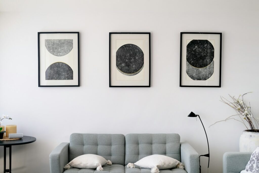
For households building an art or object collection alongside their interior, colour choices need to work as a backdrop rather than a competitor. A gallery-adjacent approach — quieter, more neutral walls in rooms where art is the focus, with bolder colour reserved for spaces without significant wall-hung pieces — tends to serve both purposes well, a balance worth considering alongside our guide on how to start collecting art, sensibly. Ceramics and tableware, by contrast, tend to sit more comfortably against colour, which is part of why the makers profiled in the ceramicists shaping the modern table often photograph so well against a saturated dining room wall.
Paint finish matters as much as the colour itself
A colour choice can be undermined entirely by the wrong finish, a detail that gets far less attention than the colour swatch itself. A high-gloss finish in a strong colour reads as sharp and almost lacquered, well suited to a powder room or joinery but often overwhelming across a large wall. A matte or eggshell finish absorbs light rather than bouncing it, softening a bold colour considerably and generally suiting larger, more lived-in rooms better than a high-shine alternative. Humid, high-traffic spaces such as kitchens and bathrooms need a finish with enough durability to withstand cleaning and moisture, which sometimes means compromising slightly on the exact matte look a homeowner initially pictured in favour of something more practical.
Limewash and mineral paints, increasingly popular among the designers pushing colour back into local homes, behave quite differently from conventional emulsion — developing a slightly variegated, cloud-like texture as they cure that conventional paint simply cannot replicate. This texture is precisely why many designers now favour limewash for a single statement wall, since the material itself does much of the visual work that a flatter paint would need bold colour alone to achieve.
Fixing a colour mistake without starting over
Not every experiment succeeds, and the households most confident with colour are often the ones who have made and corrected a genuine mistake at least once. The good news is that most colour missteps are fixable without a full repaint — adjusting lighting temperature, swapping out a rug or soft furnishings that clash, or simply repainting a single accent wall rather than an entire room. Treat an early misjudged colour choice as data rather than failure; it usually reveals something specific about the room’s light or proportions that the next attempt can correct for.
Testing before committing, properly
Beyond the standard week-long swatch test, it is worth photographing the sample wall at different times of day and reviewing those photographs together before making a final call, since a phone camera can sometimes reveal undertones the eye glosses over in person. Comparing the sample against existing fixed elements in the room — flooring, worktops, any built-in joinery that will not be changing — is equally important, since a colour chosen in isolation can clash badly with materials already locked into the space.
A confident home, not a loud one
Used well, colour is not about making a statement so much as making a room feel genuinely inhabited — a quality no amount of careful neutral restraint can quite replicate on its own. For more on how this thinking plays out across full renovations, our Homes & Culture section covers the broader design philosophy behind it.
Priya tours the homes most people only glimpse from the road, and asks how they are really lived in.