Inside a Minimalist Penthouse Above the City
Forty floors up above the city, the noise falls away entirely. Inside a composite penthouse built on restraint rather than mere square footage.
 By Priya Nair
29 August 2026 · 6 min read
By Priya Nair
29 August 2026 · 6 min read

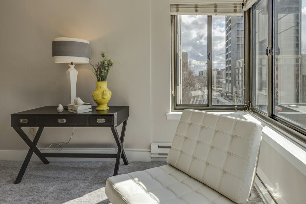
From the fortieth floor, Singapore reduces itself to pattern — container ships queued like beads offshore, the grid of HDB blocks softening into haze, the odd black-and-white roofline poking through the green. It is a view that could easily overwhelm an interior, and in a great many penthouses, it does: designers throw everything at the walls, assuming the owner wants as much inside as they have outside. This composite home, belonging to one Singapore family who asked for the opposite, argues for restraint instead.
The brief was subtraction
The owners, downsizing from a landed property after their children left for university, arrived with an unusual instruction: take away, do not add. The architect’s response was to strip the apartment back to three materials — limewashed plaster, white oak, and honed limestone — and let the skyline supply the colour. It is a philosophy that echoes the thinking behind the enduring case for natural materials, where texture is asked to do the work that pattern or colour usually does.
What stayed, and why
- A single, oversized sofa rather than a matching suite, chosen for how it ages rather than how it photographs
- Open shelving instead of upper cabinetry in the kitchen, to keep sightlines uninterrupted
- One deliberately imperfect ceramic piece on the console, sourced from a Singapore-based studio, as the sole ornament in the entire living space
Light as the real material
With so little colour or pattern to lean on, light becomes the interior’s primary texture. The apartment’s floor-to-ceiling glazing was left largely unadorned — sheer linen panels rather than heavy drapery, allowing the sun to move visibly across the plaster walls through the day. This is a lesson that applies well beyond penthouse living, and one explored in more technical depth in how to light a room properly: that most rooms are over-lit at night and under-considered in the day, and the fix is usually simpler than another fixture.
We didn’t want a home that performed luxury. We wanted one that felt like exhaling after thirty years of a much bigger house.
The bathroom as a second quiet retreat
The primary bathroom continues the apartment’s material logic almost without interruption, wrapped in the same honed limestone that runs through the kitchen, with a freestanding tub positioned to catch the same skyline view as the living room below. The owners resisted the temptation toward an overly clinical, hotel-spa aesthetic, instead choosing warmer, slightly imperfect stone and brass fittings that will visibly patina over the coming years rather than staying chrome-bright indefinitely.
Details that keep the bathroom from feeling cold
- Underfloor heating limited to the bathroom, a small indulgence in an otherwise restrained brief
- Brass rather than chrome fittings, chosen specifically for how they will age and warm in tone over time
- A single piece of art on the one solid wall, rotated occasionally rather than left permanently fixed
It is a small but telling decision within the broader apartment: even in the most utilitarian room of the home, the family prioritised warmth and eventual patina over a flawless, unchanging finish.
The kitchen as the quiet centre
Unusually for a penthouse of this scale, the kitchen was not tucked away behind a door but placed at the literal centre of the plan, wrapped in the same limestone as the bathrooms so the material reads as continuous rather than compartmentalised. The owners, both keen if informal cooks, wanted a kitchen built for actual use rather than display — deep drawers instead of shallow ones, a proper knife block instead of a hidden one, an induction hob chosen for control rather than spectacle. It is a brief shared by the makers profiled in kitchens designed for people who cook, and it shows in the wear already visible on the counter edge after eighteen months.
Furniture rules the family set for themselves
- Nothing bought purely to fill a corner
- No single piece larger than what two people could carry between them
- At least one object in every room with a visible flaw or repair
Where the colour finally arrives
The one room that breaks from the restrained palette is the smaller of the two bedrooms, repurposed as a reading room and painted a deep, almost bruised green — a colour the owners had wanted in their previous, much larger home but never found the right wall for. It is a small but telling detail: even the most disciplined minimal interiors need one room that admits a little indulgence, a principle discussed further in colour, used with confidence.
Storage that disappears entirely
A common failure point in minimalist interiors is storage — or rather, the visible lack of it, which quietly pushes clutter into corners never meant to hold it. This apartment solves the problem by pushing almost all storage into full-height, flush-fronted joinery finished in the same white oak as the flooring, so cupboard doors read as wall panelling rather than furniture. Behind those panels sits everything a family of four actually accumulates — seasonal linens, luggage, the children’s remaining boxes of books — without a single visible handle interrupting the room.
Three joinery decisions worth borrowing
- Push-to-open mechanisms instead of visible handles, kept consistent across every cabinet in the home
- A dedicated, closed store for anything seasonal or rarely used, sized generously rather than as an afterthought
- Matching the joinery finish to the flooring so storage reads as architecture, not furniture
This kind of disciplined storage planning is, in many ways, the unglamorous engine room behind every successfully minimal interior. Without it, restraint collapses within a matter of months as belongings accumulate faster than any owner intends, and the apartment starts to look merely under-furnished rather than genuinely considered.
What a smaller footprint actually teaches
The move from a landed house to a penthouse is, on paper, a downsizing. In practice, the owners describe it as an editing process that clarified what they actually valued — not square footage, but light, material honesty, and the particular quiet of being forty floors above the traffic. It is a lesson worth taking seriously regardless of the size of the home in question, and one this magazine returns to often in our wider Homes & Culture coverage: that scale and comfort are not the same thing, and the second rarely requires the first.
What lingers longest after a visit is not any single design decision but the overall sense of unhurried confidence — a home that has nothing left to prove, forty floors above a city that rarely stops trying to.
Priya tours the homes most people only glimpse from the road, and asks how they are really lived in.