
Designing With Texture, Not Just Colour
Texture does the quiet work colour alone cannot manage. A guide to layering tactile materials so even a neutral room feels rich and genuinely considered.
 By Priya Nair
30 August 2026 · 6 min read
By Priya Nair
30 August 2026 · 6 min read
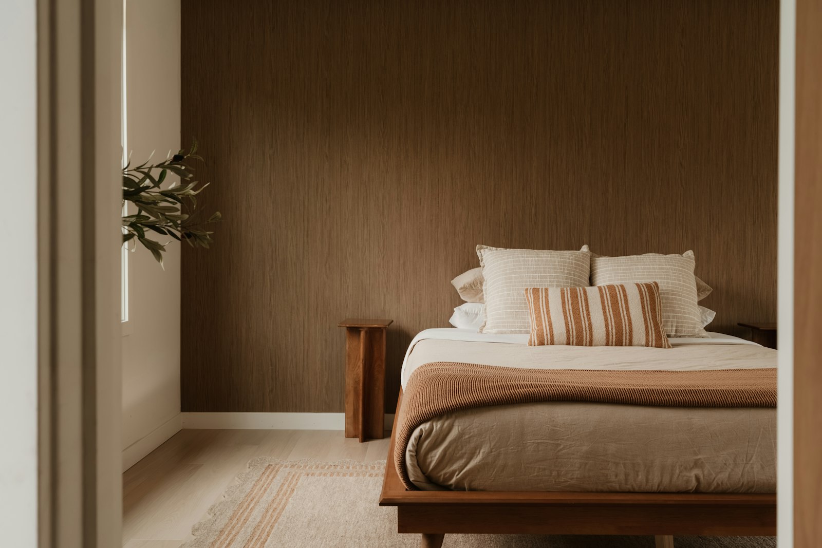
Show most people two rooms decorated in an identical neutral palette — the same cream walls, the same oatmeal upholstery, the same pale timber floor — and one will consistently feel richer, warmer and more considered than the other, even though a colour swatch of both would read as nearly identical. The difference, almost without exception, comes down to texture: the first room is layering rough linen against smooth stone against nubby bouclé against raw timber grain, while the second is repeating a single flat, uniform surface throughout. Texture is doing work that colour, on its own, simply cannot do.
Why texture reads as luxury
Texture engages a sense colour alone never can — touch, or at least the visual suggestion of it. A room rich in varied texture invites the hand as much as the eye, and that tactile invitation is a large part of why textured, tonal interiors so often read as more considered and more expensive than rooms relying on bold colour or pattern to make an impression. This is closely related to the principle we explore in our piece on why the best interiors now whisper — restraint in colour genuinely frees up texture to become a room’s primary source of visual interest, rather than competing against a busy palette for attention.
Building a textural palette, deliberately
The most successful texture-led rooms tend to combine materials from at least three distinct categories, rather than repeating variations within a single one.
Hard and soft, together
A room built entirely from soft materials — upholstery, rugs, textiles — quickly feels shapeless and lacks visual structure. Pairing soft textures against something genuinely hard and cool, such as stone, metal or glass, gives the eye a necessary counterpoint and prevents the whole scheme from blurring into a single indistinct softness.
Matte and reflective
A completely matte room, however richly textured, can feel slightly flat under artificial light. A small amount of reflective surface — a brass fixture, a glazed ceramic vessel, a mirror — catches and moves light around a room in a way that pure matte texture cannot, adding a final layer of depth without introducing any additional colour at all.
Natural fibre variation
Even within “natural materials” as a single broad category, real variation matters enormously. Raw, unfinished timber reads very differently from a smooth, oiled version of the same wood; a loosely woven jute rug reads entirely differently from a tightly woven wool one. Our piece on how to layer textiles for warmth and depth covers this specific skill of combining several fibre weights and weaves within a single room, a technique that applies to hard materials just as readily as it does to soft furnishings.
Texture and light, working together
Texture is, in a very real sense, invisible without the right light to reveal it — a beautifully nubby bouclé sofa lit only by flat, even overhead lighting will read as almost as flat as a smooth fabric would under the same conditions. Raking, directional light — from a floor lamp, a well-placed picture light, or low afternoon sun through a window — catches the ridges and variation in a textured surface and genuinely brings it to life, casting the small shadows that make texture legible to the eye in the first place. This is one of the more overlooked reasons a textured room styled for daytime photographs can feel flatter than expected once evening lighting takes over, and it is worth testing any statement texture under both conditions before committing.
“You can build an entire room around neutrals and it will never feel boring, provided you’ve genuinely varied the texture. The moment everything in a beige room has the same surface quality, that’s when it starts to feel flat.”
Texture as an alternative to pattern
For households wary of bold pattern but still wanting genuine visual interest, texture offers an effective and often more enduring alternative. A subtly ribbed cushion, a hand-woven throw, a wall finished in a soft lime-wash rather than flat paint all introduce variation and depth without the risk of a strong pattern dating within a few years the way patterned wallpaper or upholstery sometimes can. This makes texture a particularly useful tool for anyone drawn to the confident use of colour discussed in our piece on colour, used with confidence, but wanting a gentler, more forgiving route to the same sense of richness.
Where texture can go wrong
The most common misstep is treating texture the way many people treat colour — as an all-or-nothing gesture applied to a single dominant surface, rather than distributed thoughtfully across a room. A single heavily textured feature wall surrounded by otherwise flat, smooth surfaces looks disconnected rather than integrated. Texture works best distributed in smaller doses throughout an entire room — a textured cushion here, a raw timber surface there, a woven basket in the corner — building a cohesive tactile language rather than concentrating all the interest in one isolated spot.
Testing texture before committing
Texture is genuinely difficult to judge from a small swatch or an online image, since scale and repetition change how any given material actually reads once applied across a full sofa, rug or wall. Where possible, request a larger sample and view it in the actual room, under the actual lighting, at different times of day, before committing to a significant textured piece. A texture that feels luxuriously tactile in a small square often reads very differently once scaled up to cover several square metres of upholstery or flooring, and this single step of viewing a larger sample in situ prevents more costly texture mistakes than almost any other precaution.
The considered take
Texture is, in many ways, the most underused tool available to anyone decorating a genuinely neutral or restrained room, capable of delivering the richness and warmth that colour alone often cannot manage on its own. Layer hard against soft, matte against a touch of reflective, and vary natural fibre weights deliberately, and even the quietest palette will feel considered rather than simply empty. For more design thinking along these lines, visit our Homes & Culture section.
Priya tours the homes most people only glimpse from the road, and asks how they are really lived in.


